I'm going to take a picture of my cat and put him in a sunset background and adding a bit of text.


First, I create a new file and resize it to international paper, A4 size. Please ignore the McAfee alert there. -_-'

At the layers pallete, you can create a new layer by clicking the icon shown above.

You can rename your layer by double clicking at the layer. In this case, I will rename my layer as 'Cat'.

Go to File and select Place to place an image on the artboard.

Resize the image so that it will fit according to your satisfaction. After that, right-click and select place to place it permanently in the artboard.
There are a few selection tools to choose from.
 First, there's the marquee tool, which has four types of selection tool: rectangular, elliptical, single row and single column.
 Second, there's the selection tool which consists of quick selection tool and magic wand tool.
 But for now, I will use the lasso tool, specifically the magnetic lasso tool to take out only my subject (my cat) from the whole picture.
 Move the mouse and drag it along the outline of the subject that you want until it is closed (you will know this when a small circle appears at the cursor)
 Right-click on the selected object and choose Layer via Copy to separate it from the picture. You can also choose Layer via Cut.
 The new selected object will be placed in another layer. It is not separated yet from the background. If you still want to keep the background but would like to see the selected object only, you can click on the eye at the selected object's layer, like so:
 If you don't want to keep the rest of the unselected picture, you can just delete the original layer it was on by clicking the trash can icon or dragging the layer to the icon.

Okay, so here's the selected object. It doesn't look too good with the jagged edges, right?

You can select the eraser tool to erase the jagged edges and make it look smoother and better. There are three different modes of eraser at the option bar above:

As for me, I like to use the brush mode as it gives a soft edge to the outline of the object. But it's your choice, you can choose either pencil, brush or block. :)
 Erase the jagged edges by dragging the mouse along the edges. Zoom in for a better precision and better view.
So the finish product will look like this:
 To put in a background, I placed another picture on the artboard, like so:
 Since the layer where the BG (background) is is above the layer of the object, it is considered placed on top of the the cat. You can drag the layer of the background to be below the cat's layer:
 Now, the cat is on top of the BG, so there should be no problem.
You can select the Move tool to adjust the position of the object in the picture. Select the layer of the object and move it by dragging with the mouse to the position that you want.

I wanted to put more light in the background to highlight the sunset even more. Go to Filter and select Render > Lighting Effects.
 You can change the lighting effects any way you want by playing with the options in the Lighting Effects window.
 After that, I wanted to darken the cat a bit so it will look like it's shadowed by the light of the sunset. Go to Image and select Adjustments > Brightness/Contrast.
You can adjust the brightness and darken the object with Contrast.
 The picture will now look like this:
I now want to add text to the picture. Click on the new layer button and rename the new layer as Text.

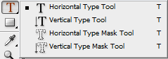
Go to the Type Tool icon and you can select the type of typography that you want: Horizontal, Vertical, Horizontal Type Mask and Vertical Type Mask.
I choose the Horizontal Type tool for my Picture. To create new type, drag the mouse on the picture and release it. You can adjust the size and the type of font at the option bar above.
 You can change the font colour from basic black to any colour you want:
 That's my cat's name: Willie. :D
When the text colour window pops up, you can click on the Color Libraries and pick from a selection of colours and choose from any colour books. In this case, I pick Pantone Solid Coated.
 After editing your text, here's what it will look like:
The text doesn't look good being in front of the object. So I did the same thing with the cat and the BG by dragging the layer of the text below the cat's layer.

So now, it will be like this:

I move the object and the text to a better position using the Move tool.
 You can change the look of the text by clicking on the Layer Style icon at the Layer palette.
Here, you can play with the styles like shadows, gradients, glows and strokes.

I added a bit more lighting on the cat to increase the visibility so you can see the cat's features a bit more. I selected the cat's layer and used the Lighting Effect that I did before.

After finishing it, I saved the file as JPEG, a picture file.

I set the quality to a 10, the maximum level.

Here's the finished product:
 I hope my peers can understand or even learn a little bit of something from my post here. I will try to help my fellow classmates if I can.


